INDEPENDENT · 2026
From idea to working software for a live wind forecast tool.
A rapid solo project where building was the fastest way to reduce uncertainty about the product.
Open prototype
Role
Designer & Builder
Organization
Gusty (Independent)
Timeline
2026
Team
Solo
Platform
Web
Capabilities
Product design, prototyping, implementation
Gusty is a concept-to-production tool for reading live wind conditions, designed and built solo.
Mandate
Design and ship a working tool quickly enough to test the core idea.
Core constraint
Time — a solo build had to reach a real verdict before momentum ran out.
Chapter One: The Question
“Is it safe to enter the backcountry today?”
Every trip begins the same way. Coffee before dawn. Gear laid out on the floor. The quiet ritual of packing, checking, and re-checking before the light comes up.
Then comes the reading. Avalanche bulletins. Regional forecasts. Wind models. A dozen tabs, each telling a slightly different story about the same mountain.
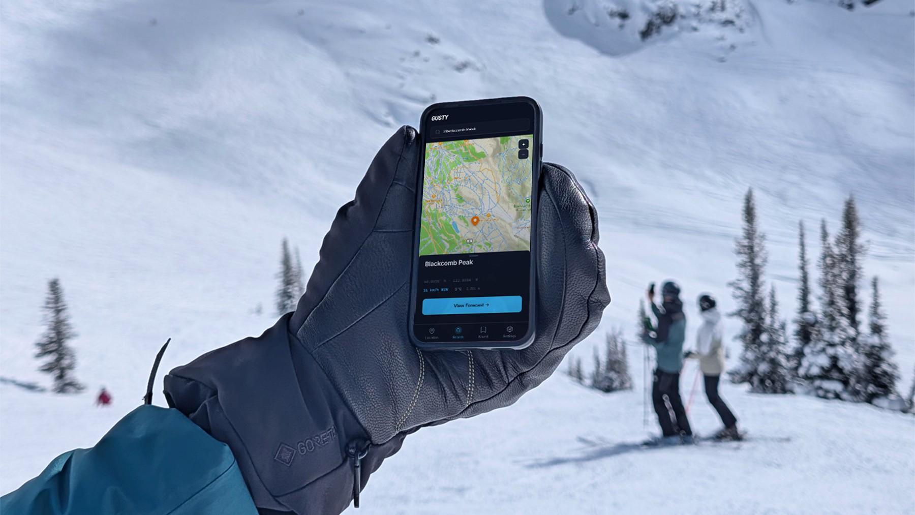
A forecast for Whistler Village tells you almost nothing about wind conditions on a ridge a thousand metres higher. That difference can completely change a day’s objective, or whether you go at all.

Musical Bumps, Whistler, British Columbia, where a thousand vertical metres separates the forecast from reality. Photo by the author, January, 2026.
Chapter Two: The Problem
Weather forecasts aren’t designed for mountain decisions.
Most forecasting tools are built around cities: broad regions, populated valleys, the places where the majority of people happen to be.
Backcountry users make decisions at specific coordinates, elevations, and terrain features. The gap isn’t information. The gap is precision.
Gusty was never meant to replace the bulletin. It’s a companion, closing the distance between a regional forecast and the exact place you intend to stand.
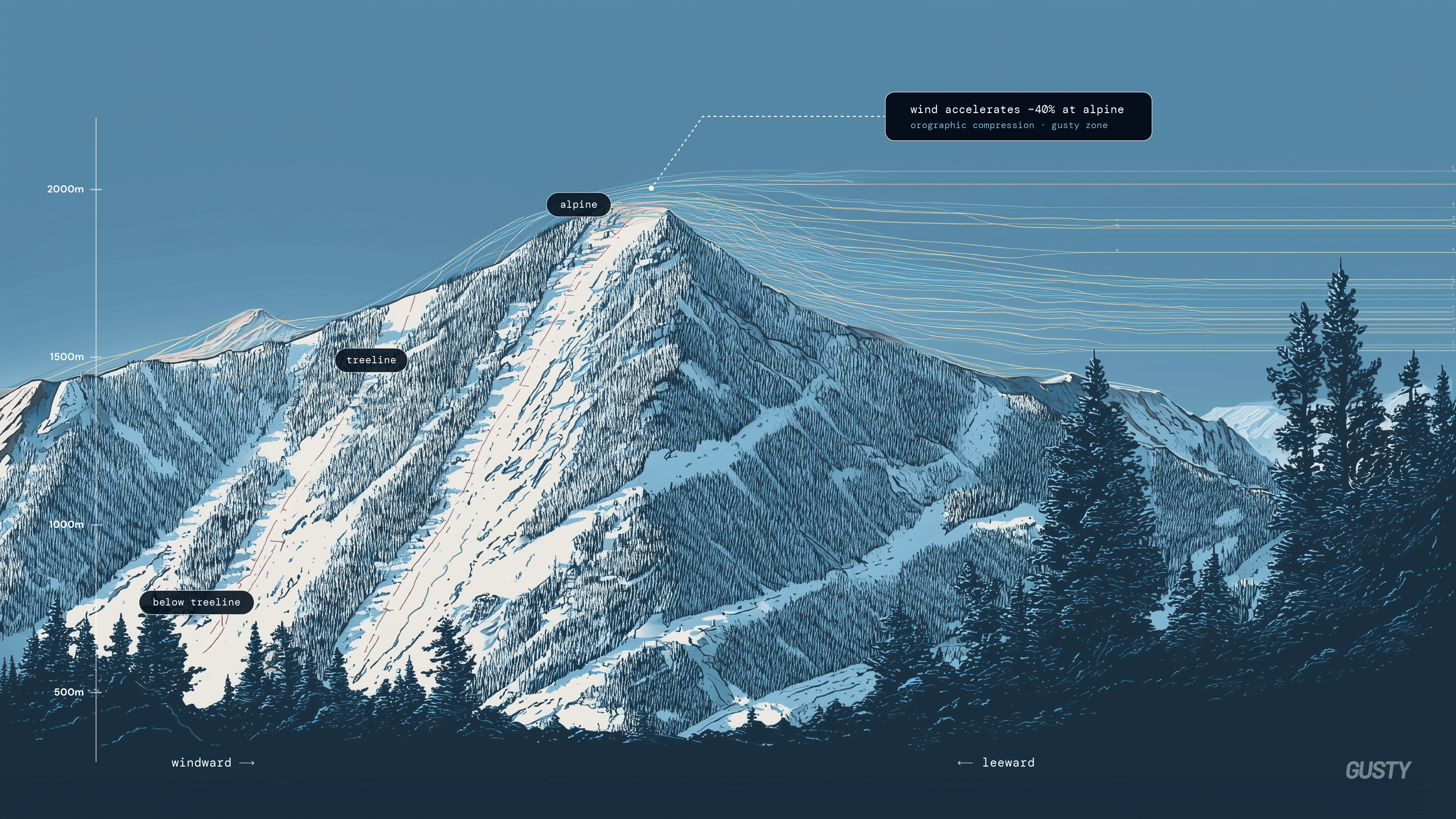
Wind affects snow differently at every elevation and aspect. That's why a sea-level forecast tells a backcountry user almost nothing about snow stability in the mountains.
Chapter Three: Product Insight
The goal wasn’t better forecasts. It was better decisions.
Everything in Gusty was designed around reducing cognitive effort during planning. The user isn’t browsing. They’re deciding. This single insight shaped every screen, interaction, and piece of information in the product.
Chapter Four: Designing the System First
The system came before the screens.
Before a single screen was built, Gusty had a language: a type scale, a colour system, spacing, components, and tokens defined up front.
That decision paid off later. A well-defined system gave AI-assisted development a precise vocabulary to build against, which dramatically improved consistency across the product.
01: Typography
Aa
Inter for UI · DM Mono for data · Barlow Italic wordmark
02: Colour System
Background
Surface
Accent
Muted
03: Wind Colour Ramp
Calm
Light
Moderate
Strong
Severe
Extreme
04: Components & Tokens
Primary
Secondary
Favorable
Appendix: The complete system
The language behind the interface.
What follows is the working reference the whole product is built from: the same colour ramps in light and dark, accessibility proofs against WCAG 2.1, the icon library, and the button matrix in every state.
Colour · Light & Dark
Six semantic tokens carry the entire interface. Each renders as a matched pair: left column is the light-theme value, right column its dark-theme counterpart.
Gusty / Paper
Base background
L rgb(250, 249, 246) D rgb(14, 14, 13)
Gusty / Ink
Primary text
L rgb(22, 21, 15) D rgb(244, 241, 235)
Gusty / Ink Soft
Secondary text
L rgb(107, 104, 98) D rgb(166, 162, 154)
Gusty / Accent
Links, focus & data
L rgb(58, 90, 107) D rgb(137, 176, 196)
Gusty / Surface
Cards & panels
L rgb(255, 255, 255) D rgb(26, 25, 23)
Gusty / Hairline
Dividers & borders
L rgba(22,21,15,.14) D rgba(244,241,235,.16)
Accessibility · WCAG 2.1 Contrast
Every text-on-surface pairing is measured against the WCAG 2.1 contrast formula. All ten core pairs clear AA (4.5:1); most also clear the stricter AAA threshold (7:1).
Aa 18px
Ink → Paper
Light
17.37:1
AA
AAA
Aa 18px
Ink Soft → Paper
Light
5.27:1
AA
Aa 18px
Accent → Paper
Light
6.99:1
AA
Aa 18px
Ink → Surface
Light
18.29:1
AA
AAA
Aa 18px
Label → Button
Light
17.42:1
AA
AAA
Aa 18px
Accent → Surface
Light
7.36:1
AA
AAA
Aa 18px
Ink → Paper
Dark
17.13:1
AA
AAA
Aa 18px
Ink Soft → Paper
Dark
7.59:1
AA
AAA
Aa 18px
Accent → Paper
Dark
8.34:1
AA
AAA
Aa 18px
Ink → Surface
Dark
15.58:1
AA
AAA
Buttons · Variants & States
Three button roles, each specified across the four interaction states: resting, hover, keyboard focus, and disabled. Focus rings use the Accent colour at 35% for a visible, accessible ring.
Primary
Get forecast
Default
Get forecast
Hover
Get forecast
Focus
Get forecast
Disabled
Secondary
View map
Default
View map
Hover
View map
Focus
View map
Disabled
Ghost
Learn more
Default
Learn more
Hover
Learn more
Focus
Learn more
Disabled
Chapter Five: Designing the Experience
One screen at a time.
The product reveals itself the way it’s meant to be used, one decision at a time. Each screen exists for a reason, never for a feature list.
Speed. Clarity. Confidence. The interface gets out of the way so the decision can come into focus.

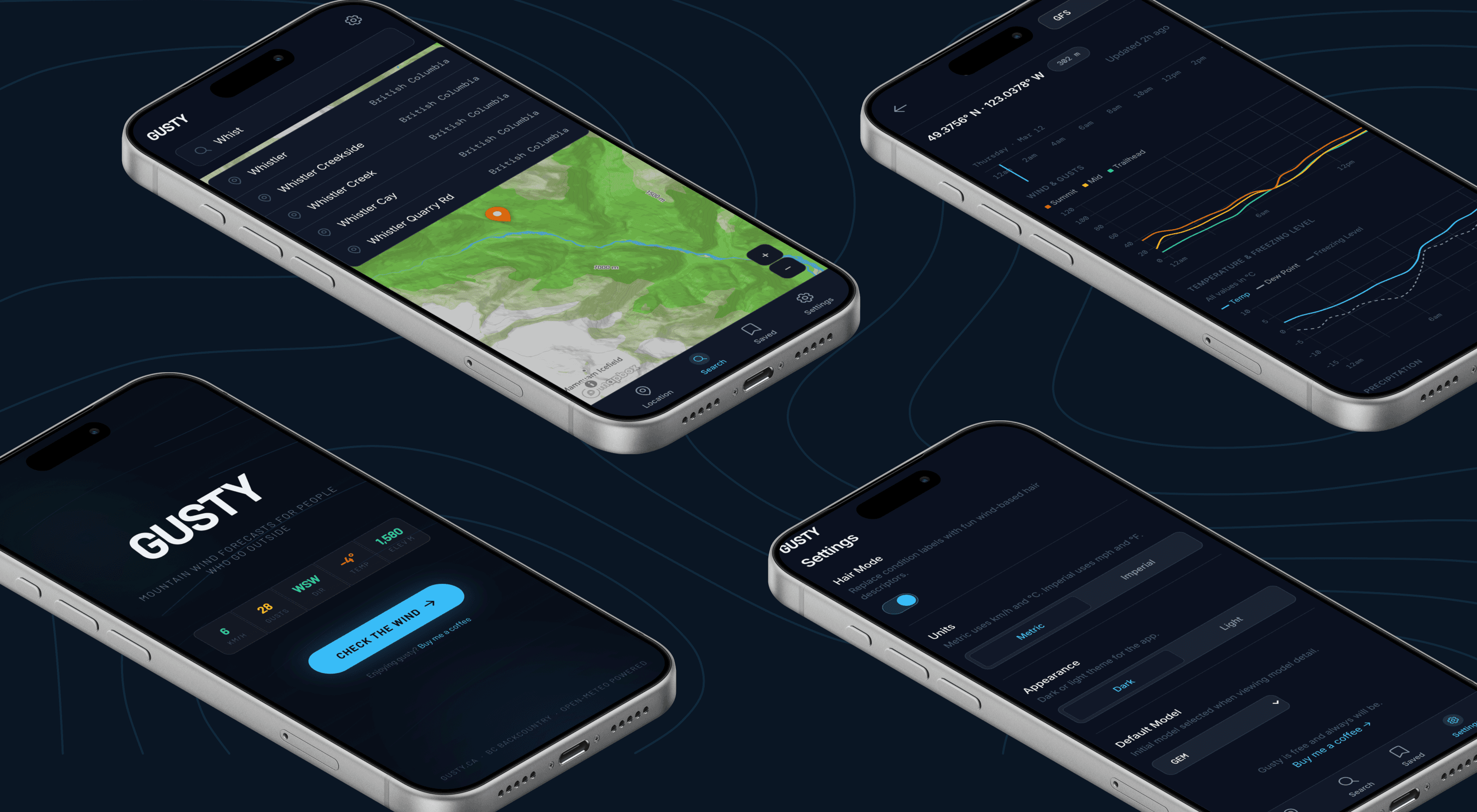
Forecast
Forecast
The first thing you see is a decision, not a dashboard: today’s conditions at your saved locations, ranked by relevance.
Search
Search
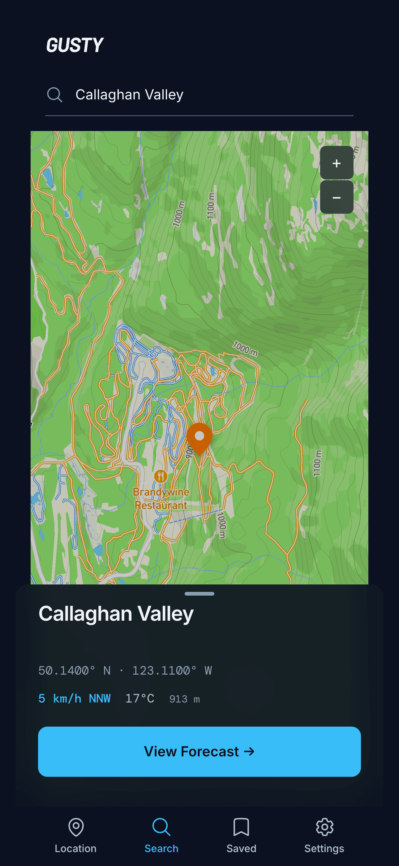
Finding a precise point should take seconds. Search resolves to exact coordinates and elevation, not just place names.

Gusty Settings
Select your desired forecasting model, change units, or switch between light and dark mode.

Forecast Detail
When it matters, depth on demand: wind, temperature, and multiple models layered into a single, calm read.
Chapter Six: AI-Assisted Development
Design first. AI second.
AI compressed the distance between intent and implementation. It did not replace the thinking that came before it.
The interaction model, the hierarchy, the visual language, the design system, and every UX decision were deliberate, made by someone who understood the domain and the person using the product.
AI became an implementation partner, not the creative director.
Used this way, AI is leverage. The judgement about what to build, and why it’s worth building, still has to be earned.
Design & Build Stack
Tech Stack
Frontend
Maps
Charts
Weather data
Geocoding
Version control
Editor
Fonts
Vanilla HTML, CSS, JavaScript
Mapbox GL JS
Chart.js
Open-Meteo API
Mapbox Geocoding API
GitHub
Cursor
Inter and DM Mono
Chapter Seven: Outcome
Quiet numbers, honestly earned.
332
Unique visitors in the first month.
59%
Mobile users.
37%
Senior-level audience.
Zero
Paid promotion.
The greatest success wasn’t building another weather app. It was demonstrating how strong product thinking and AI-assisted development can dramatically reduce the distance between an idea and a working product.
Lesson 01
Great outdoor software reduces uncertainty.
The best tools remove doubt, they don’t add features.
Lesson 02
Domain expertise matters.
You can’t design for a decision you don’t understand.
Lesson 03
Design systems accelerate AI-assisted development.
A shared language lets a machine build with intent.
Lesson 04
Good interfaces support decisions, not data.
Data is easy to show. Decisions are hard to support.
In Closing
AI didn’t replace product design. It amplified it.
Gusty became proof that the limiting factor in building thoughtful software is no longer implementation. It’s choosing meaningful problems worth solving.
Related work