Client · 2014 — 2016
Designing the core product experience of a branchless digital bank.
Onboarding, money movement, and account management for a Canadian challenger bank. Designed to make an unfamiliar banking model feel clear, credible, and trustworthy.
Visit product site

Role
Product Designer · 1 of 4 core product designers
Organization
Equitable Bank · EQ Bank
Timeline
Initial product design delivered in 8 weeks · involvement continued through 2016
Team
4 designers within a multidisciplinary client and delivery team
Platform
iOS, Android, Web
Capabilities
Product design, interaction design, prototyping, design systems, cross-platform delivery
Equitable Bank was creating a new kind of Canadian bank: branchless, digitally native, and positioned against the country’s established financial institutions. The experience had to earn trust without relying on a physical branch.
Mandate
Design the core customer experience across sign-in, onboarding, account management, transfers, and Remote Deposit Capture — while establishing reusable patterns that could scale across platforms.
Core constraint
We were building an entirely new customer experience on top of Temenos banking technology. Every decision had to balance customer needs, regulatory requirements, platform constraints, and an aggressive launch timeline.
Some screens are representative recreations.
Overview
Core Product Flows
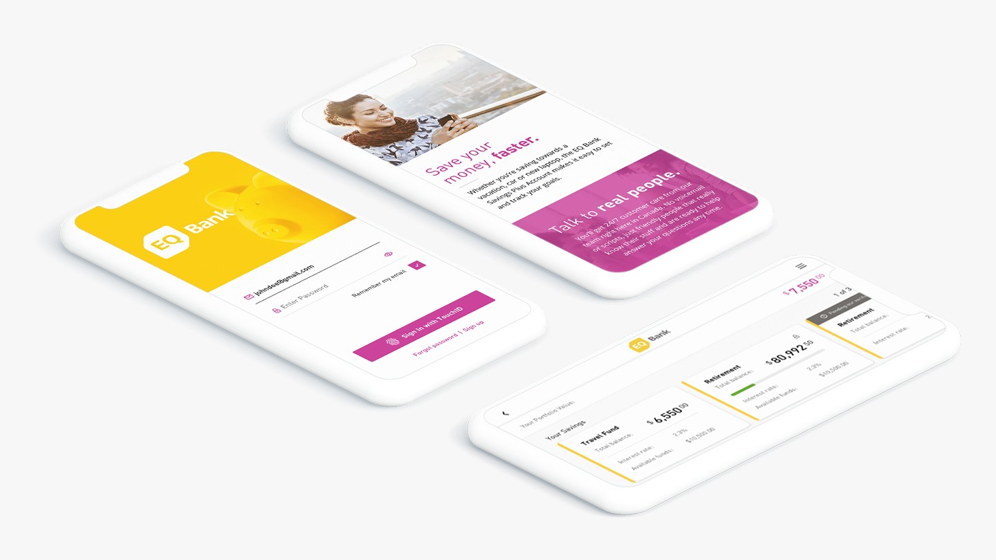
Key experiences across onboarding, authentication, money movement, account management, and mobile cheque deposit
01 — Onboarding
A guided first-run, built around customer confidence
Designed a step-by-step onboarding flow that translated regulatory and eligibility requirements into a focused, understandable account-opening experience.
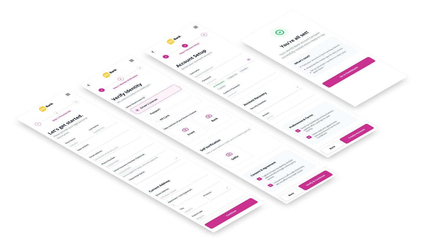
STEP 01
Identity & eligibility
Personal and eligibility information is captured with inline validation, helping customers resolve issues in context rather than after a failed submission.
STEP 02
Guided verification
Progressive disclosure keeps each step focused and explains why sensitive information is required, reducing cognitive load while reinforcing trust.
STEP 03
Review & activate
A clear review and confirmation step gives customers control before activation and communicates what will happen next.
02 — Prototype
Bringing the first-run experience to life
Prototyped the complete journey to test sequence, validation, system feedback, and the transitions between customer actions and banking requirements.
03 — Account Experience
One consistent system across every account view
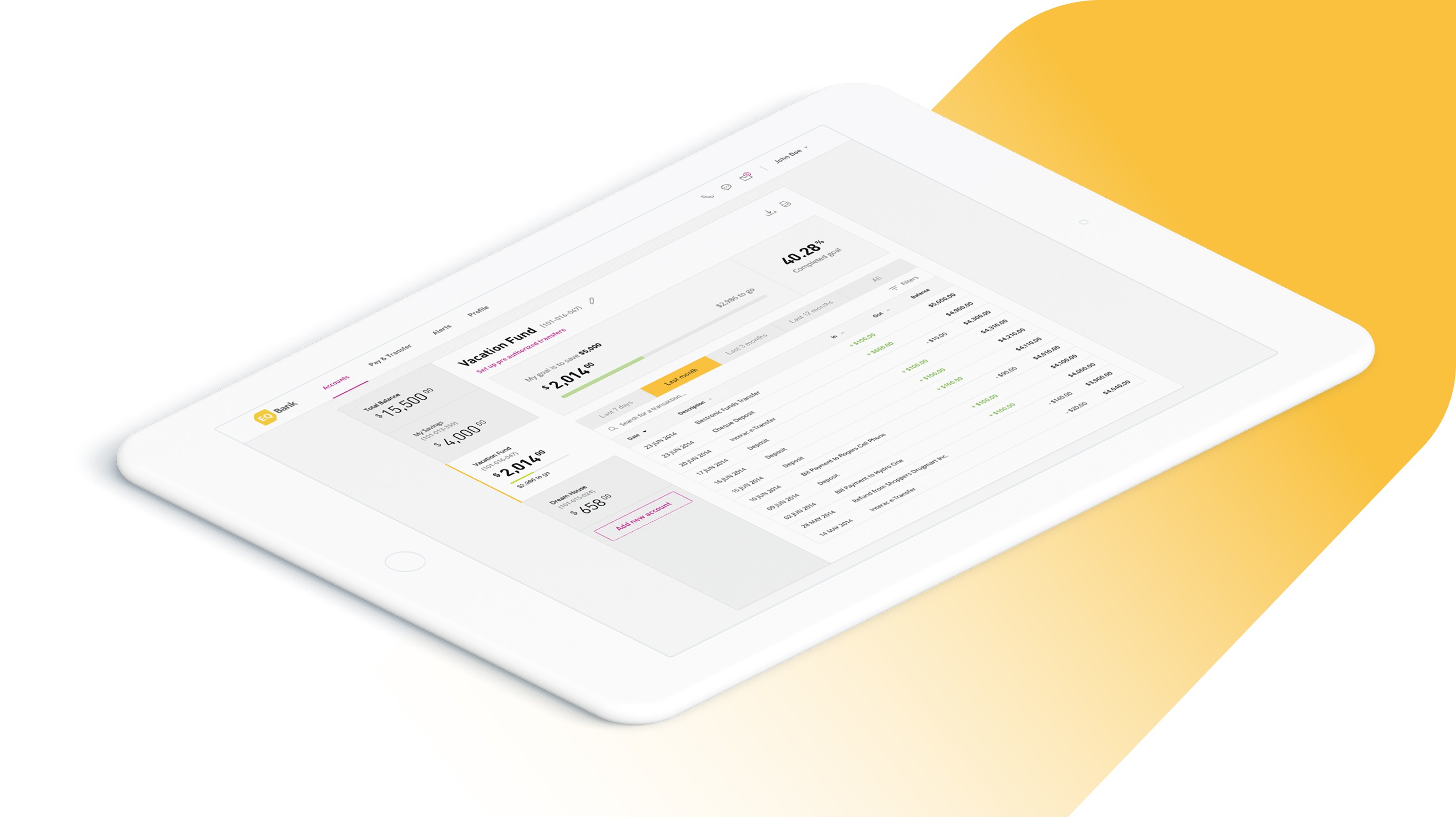
Applied shared patterns across balances, transactions, transfers, and account states so customers did not have to relearn the interface as they moved through the bank.
Design System Foundations
Style
Weight
Size
Line
Header
Bold
28
34
Number Display
Regular
26
30
Card Header
Regular
16
24
Titles
Bold
16
19
Text Fields
Regular
16
19
Caption
Regular
14
24
EqB
Bold
EqB
Regular
#FFCD33
#CB3694
#000000
#6D6761
#DEDEDE
#FFFFFF
Established standards for typography, colour, iconography, form behaviour, and interaction states, helping a large delivery team create a coherent experience across web and mobile.
Trust was the product strategy.
EQ Bank was asking customers to place their savings in a bank they could not visit. Trust therefore had to be expressed through the product itself: clear language, predictable behaviour, visible system status, careful confirmation, and consistency across every high-stakes interaction.
Designing around the customer’s mental model
The banking platform exposed complex processes and terminology. Our role was to translate those requirements into familiar, understandable interactions — starting with what customers were trying to accomplish rather than how the underlying banking system was structured.
Remote Deposit Capture
Mobile cheque deposit was a significant product innovation at the time. Instead of inventing an unfamiliar interaction, we drew from behaviours customers already understood through photography: frame the cheque, align it, capture both sides, review the images, submit the deposit, and receive clear confirmation.
The interaction also had to set accurate expectations. Customers naturally wanted immediate access to deposited funds, while banking policy could require a five-day hold. We made the deposit state and expected availability visible rather than allowing a successful capture to imply that the money was immediately accessible.
Designing within Temenos constraints
The bank was built on Temenos, an established core banking platform that was not designed around the differentiated experience EQ Bank wanted to create. We worked closely with technical and client teams to determine where the platform could be customized, where constraints were fixed, and how to preserve a coherent customer experience across those boundaries.
Rather than allowing the underlying system to dictate the interface, we used shared patterns, prototypes, and design standards to create a product that felt distinctly EQ Bank. Its gold and magenta visual identity reinforced that ambition: a deliberate departure from the conservative visual language of Canada’s legacy banks.
659K
Customers
$10B+
Customer deposits
5 years
Named one of Canada’s top banks by Forbes
Related work